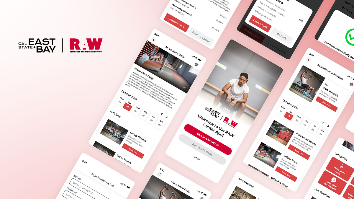
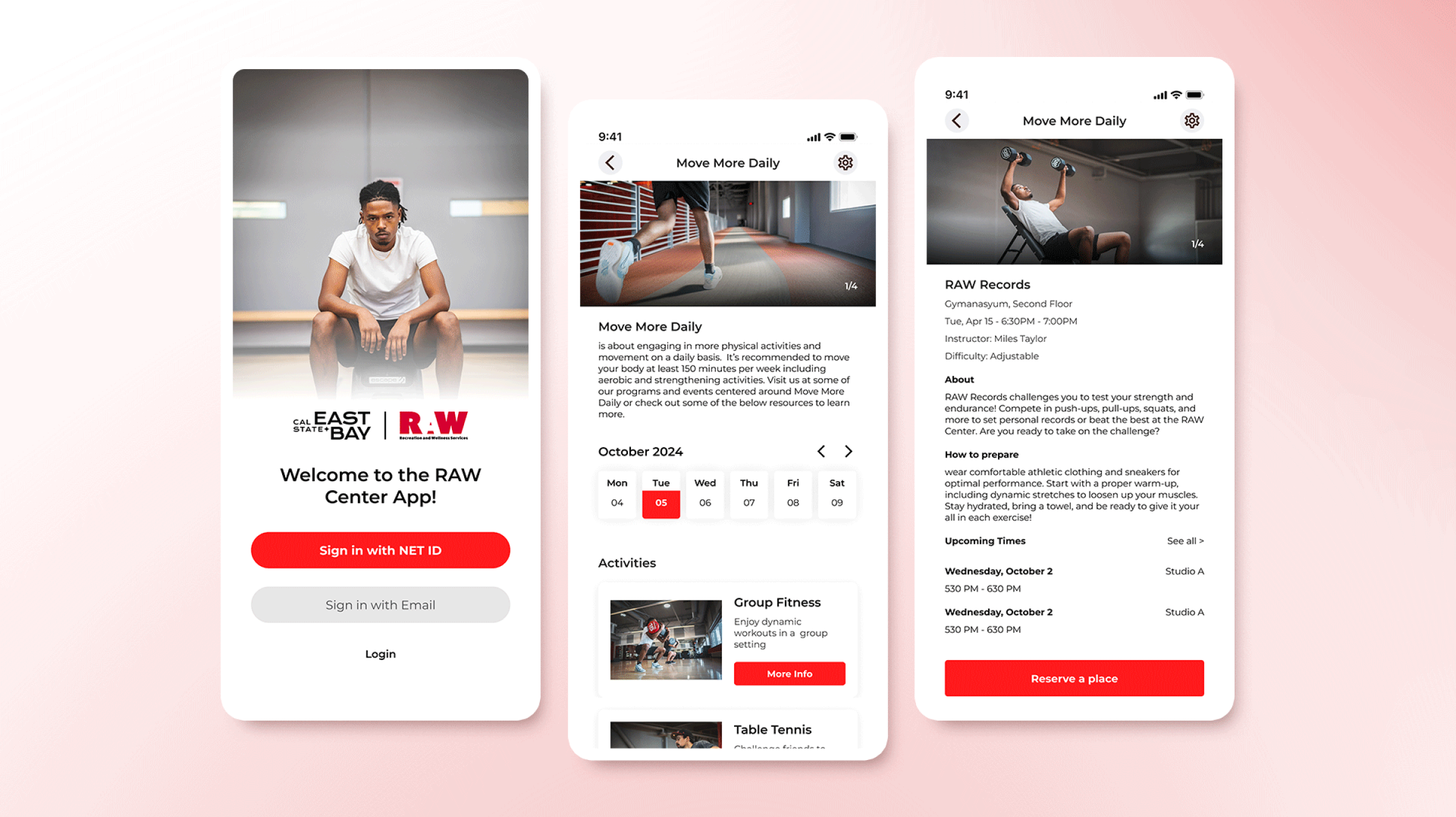
As a former Graphic Designer at the RAW, I experienced firsthand the challenges of navigating and booking services through the app. This inspired me to create a more intuitive and user-friendly solution.
Market Research
The Problem
Due to an unintuitive interface, users see the RAW Center mainly as a gym and struggle to discover, book, and reschedule a wider range of services effectively.
The Claim
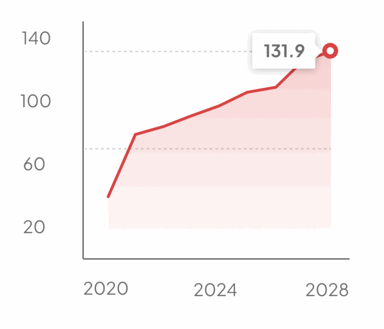
In 2020, gyms and health clubs held 40.6% of the market, or $63.7 billion, with projections to reach 131.9%, approximately $206.8 billion, by 2028.
Competitive Analysis
For my market research, I examined three health and fitness apps, Mindbody, ClassPass, and Glofox, that offer booking and scheduling services for classes.
My focus was on uncovering patterns, best practices, and features that improve the user experience.
Classpass
Glofox
Mindbody
The Good
All three apps offer personalized recommendations and fitness access, with Mindbody providing wellness services, Glofox a simple interface with premium content, and ClassPass categorizing workouts by intensity.
The Bad
Mindbody has slow screen transitions and a buggy login process; Glofox requires separate registrations for each facility; and ClassPass lacks a free version, needing credit purchases for access.
Problems from the Comments
It would be nice if the app gives me an option to remove the appointment from my calendar when i cancel it.
Adam
Why can’t filter by time? I hated to scroll through all classes even if I filter by time period. The classes listed are not Chronological order.
Alex
Why is it so hard to make the function add to calendar work in the app. It can’t be that hard. All the other apps are able to do it.
Emma
User Survey
I conducted a quick survey on the CSUEB Discord to gather feedback from users of the RAW member app.
What improvements would make the RAW Member App more useful for you?
15 Participants
Faster and smoother booking process
33.33%
More intuitive and easy-to-navigate interface
6.7%
Personalized class or workout recommendations
20%
Better class schedule visibility and reminders
20%
Improved barcode check-in process
20%
Notable Comments
I often struggle with the app’s navigation. It’s not intuitive, and I find myself getting frustrated when I try to find classes.
Giovanni
It’s hard to know what activities are happening when I get to the center. The app doesn’t show the schedule clearly.
Raj
The barcode check-in is a hassle because it takes too many clicks to open. When I’m checking in, I just want to get it done quickly.
Vinicius
Initial Research Shows
Users reported a confusing booking process and difficulties accessing the barcode check-in. Many found it hard to know which activities are available and to receive timely reminders.
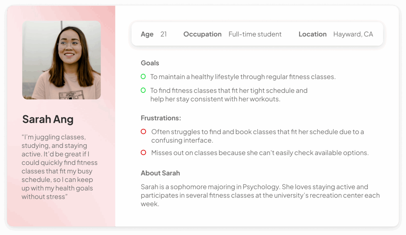
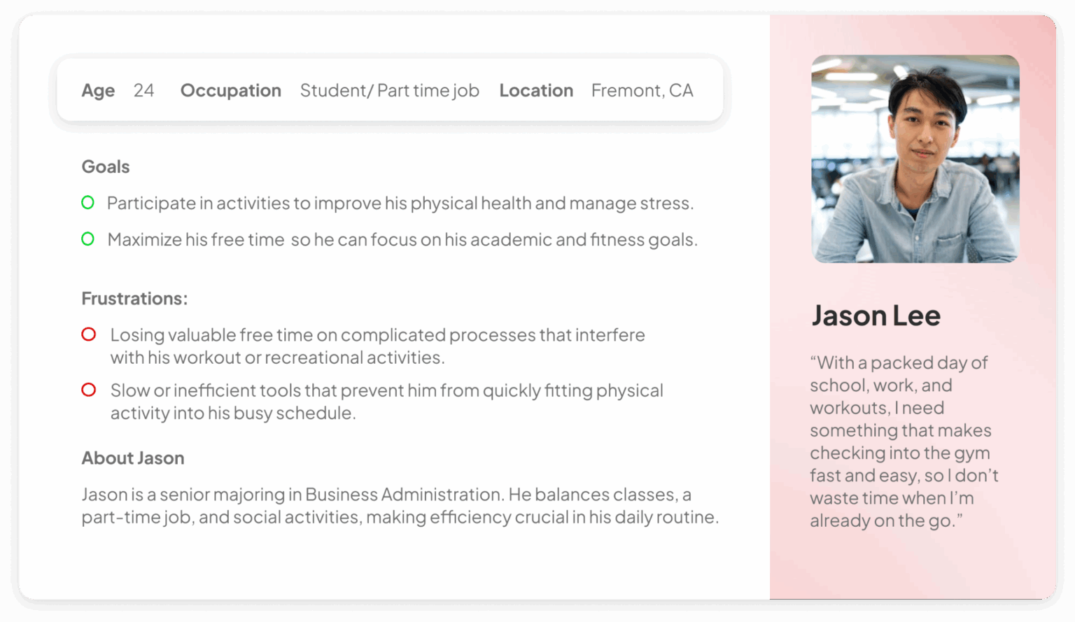
User Personas
I developed two user personas to represent the user stories: one centered on booking a class seamlessly and the other on accessing the barcode check-in quickly.
Time to start designing!
With all the research data gathered, it’s time to start designing. I will begin by sketching the initial user flows and creating low-fidelity wireframes.
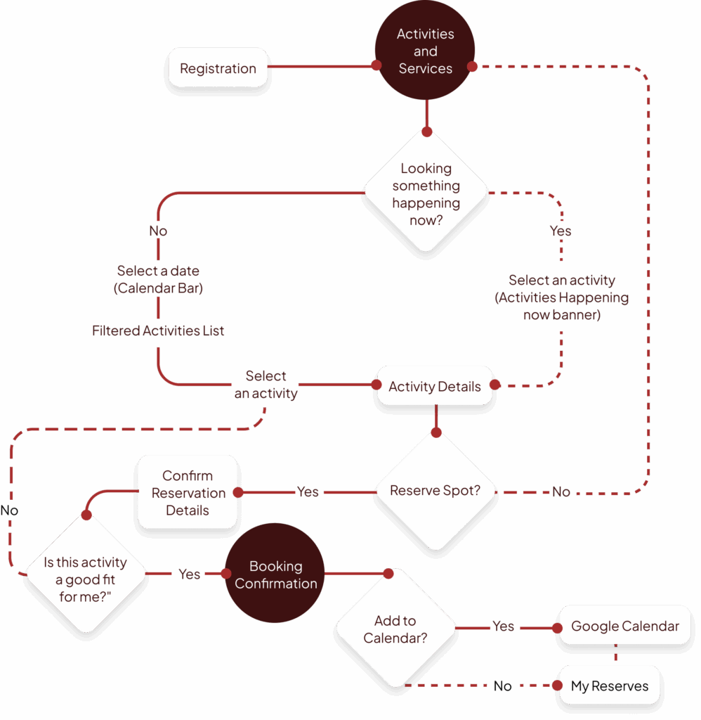
Flow Diagram
To define the essential functionality for booking and scheduling services, I developed a straightforward flow diagram that illustrates the user journey for this particular process.
Booking Flow
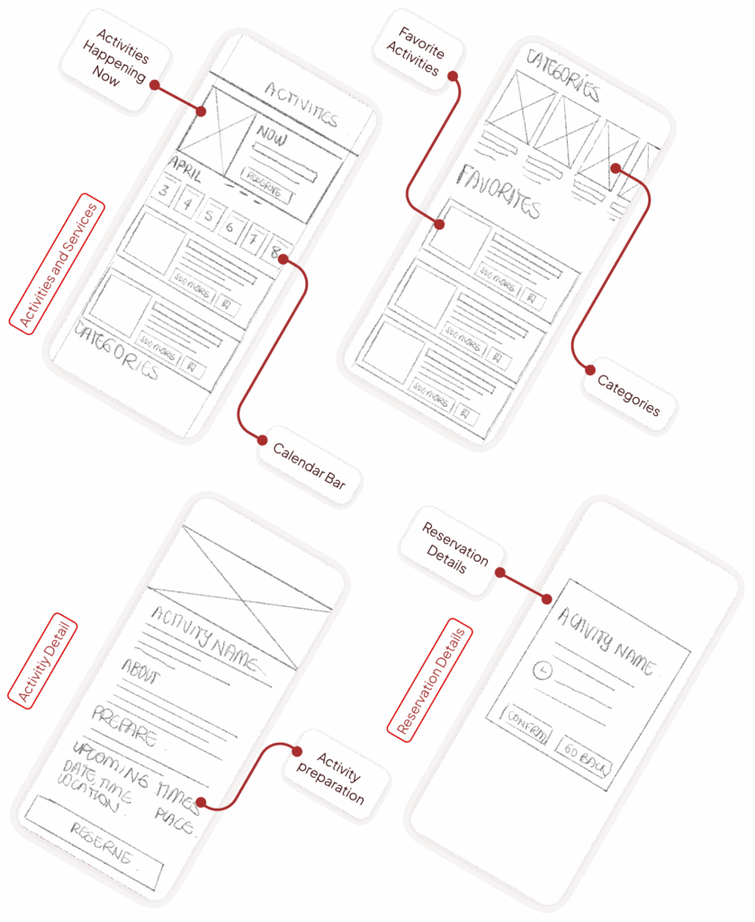
Low Fidelity Wireframes
Once the user flow was established, I created low-fidelity wireframes to visualize the core screens and interactions within the RAW Member app. These wireframes serve as a foundational blueprint, highlighting essential functionalities such as logging in, browsing activities, selecting dates, and booking services.
High-Fidelity Wireframes
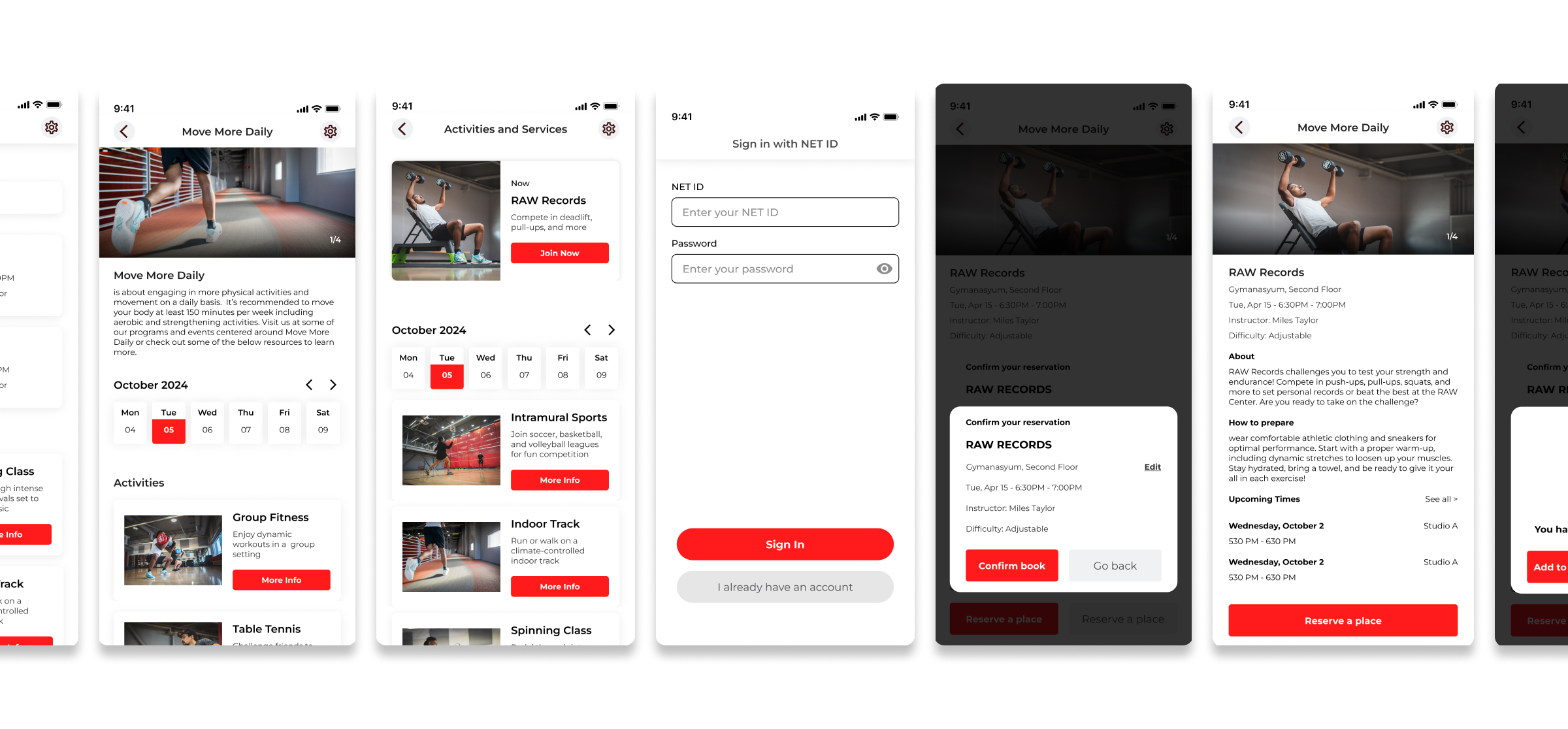
Once the layout and functionality were defined in the low-fidelity wireframes, I moved on to creating high-fidelity designs focused on the Scheduling process.
Color Pallette
Accent, Primary, secondary, background
Font
Montserrat Regular/Semibold
AaBbCcDdEeFfGgHh
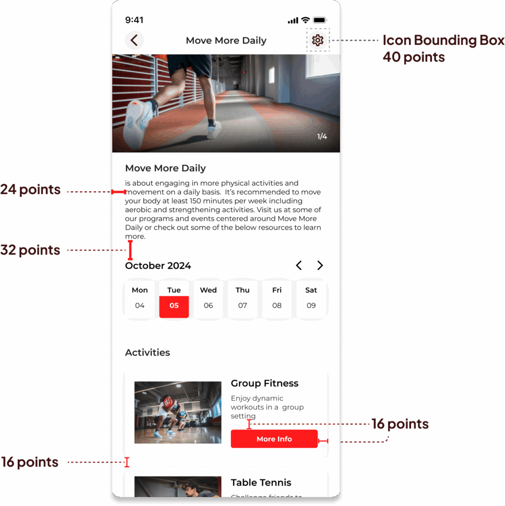
Aligment and grid
I used an 8-point grid system to ensure consistency and balance throughout the interface. The layout follows a 24-point margin for outer spacing, with 32 points separating major sections to create clear visual divisions. Within sections, elements are spaced at 16 and 8 points, maintaining a clean and organized flow that improves usability and readability across devices.
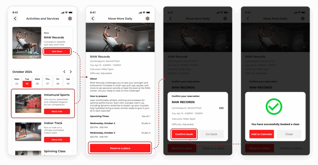
High-Fidelity Prototype
For the high-fidelity prototype, I focused exclusively on the booking process. This prototype refines the user experience, showcasing a visually polished and intuitive flow for scheduling activities and services.
The project involves the redesign of the RAW Member app, focusing on enhancing the user experience for booking services and activities at the Recreation and Wellness Center (RAW) at California State University East Bay. The primary goal is to create an intuitive and user-friendly interface that addresses the challenges users face when navigating the current app. Through user research and interviews, key pain points were identified, including the perception of the RAW as merely a gym and the difficulties users encounter when trying to discover and book a wider range of services. This feedback guided the development of a streamlined scheduling process that incorporates an 8-point grid system for layout consistency.